

Traffic alone rarely determines ecommerce growth. Many stores invest heavily in acquisition while their landing pages still make it difficult for visitors to understand the offer, trust the brand, or take the next step. In those cases, improving visual design can unlock significant conversion gains without increasing ad spend.
Landing page design influences how quickly visitors interpret the product, how comfortable they feel navigating the page, and whether they remain engaged long enough to evaluate the offer.
Layout structure, typography, imagery, and visual hierarchy all affect this process. When these elements work together, the page becomes easier to scan and the purchase journey becomes clearer. When they do not, friction appears early and users leave before they fully understand the value being offered.
Design should support the way users actually process information online. When it does, the page becomes easier to scan, the product becomes easier to evaluate, and the path toward conversion becomes clearer.
When the structure of the page forces visitors to interpret the interface instead of focusing on the offer, hesitation appears early and engagement drops, even when the product itself is strong.
Why Visual Design Has a Direct Impact on Ecommerce Conversions
When users arrive on a landing page, they do not immediately read the copy in detail. Instead, they scan the page quickly to understand whether the content appears trustworthy and relevant.
Within a few seconds they are already forming an opinion about the store. The visual structure of the page largely determines this first impression.
If the layout feels crowded or poorly organized, users anticipate effort. They expect that understanding the product will require time and attention, and many leave before reaching the core value proposition.
In contrast, a page with clear hierarchy and visual balance communicates that the information will be easy to process. This alone increases the likelihood that visitors will continue exploring.
Design also affects how efficiently users can evaluate the product itself. Ecommerce visitors typically scan headings, images, and highlighted elements rather than reading everything sequentially.
Pages that support this behavior help users build understanding quickly. Pages that resist it slow the buying process.
How Design Shapes Brand Trust in Seconds
Trust is closely tied to visual presentation. Before visitors consider pricing or features, they subconsciously evaluate whether the store appears credible. Professional imagery, consistent spacing, and a well organized layout signal that the brand is reliable and detail oriented.
Conversely, subtle design issues can undermine confidence. Low-resolution images, inconsistent typography, or visually dense sections may suggest a lack of care in the overall experience. Even when the product itself is strong, these signals introduce doubt early in the journey.
Strong ecommerce design does not require visual complexity. In many cases, simplicity reinforces trust because it communicates clarity and control over the information presented.
Design Is a Conversion Strategy
Many teams initially approach design as a branding activity. In ecommerce, however, design decisions directly influence behavior.
The arrangement of elements on the page determines what visitors see first, what information they process next, and how easily they identify the next action.
A landing page structured around the buyer’s decision process typically performs better than one organized purely around visual preference.
Visitors first need to understand the product and its value. They then evaluate credibility through reviews or guarantees. Only after these steps are completed does the call to action become meaningful.
Design that supports this sequence makes the buying journey feel natural. Visitors do not need to search for information or interpret the page structure. Each section leads logically to the next.
How Visual Clarity Reduces Friction in the Buying Journey
Friction in ecommerce often appears when visitors must stop and interpret what they are seeing. This might occur when multiple elements compete for attention, when sections lack visual separation, or when key information is hidden in dense blocks of text.
Visual clarity reduces this problem by structuring the page into distinct stages. Headings communicate the purpose of each section, spacing separates ideas, and visual emphasis highlights the most important actions.
Instead of deciphering the page, users simply follow the flow of information.
Reducing friction is particularly important on landing pages because these pages often serve as the first interaction with a product or offer. When the page structure helps visitors understand the value quickly, the likelihood of conversion increases.
The Core Principles of High-Converting Ecommerce Landing Page Design
Effective landing pages tend to share a set of structural characteristics that make them easier to interpret. These principles are not tied to a particular design style. Instead, they focus on how information is presented and how attention is guided.
Visual Hierarchy: Guiding the User’s Attention to the Right Action
Visual hierarchy determines which elements stand out first.
In most ecommerce landing pages, the headline introduces the primary value proposition while supporting sections expand on the benefits or product details. Images reinforce the message visually, and calls to action provide a clear path forward.
Hierarchy is created through contrast, spacing, and scale. Larger elements draw attention before smaller ones, and strategic spacing isolates important components so they are not lost in surrounding content.
When hierarchy is unclear, visitors must work harder to understand the page. When it is well designed, the sequence of information feels intuitive.
Clean Layout and White Space: Why Simplicity Improves Engagement
Many landing pages lose effectiveness because they attempt to present too much information simultaneously. Excessive visual elements compete for attention and reduce clarity.
White space plays an important role in solving this problem. It allows sections to breathe and helps visitors distinguish between different parts of the page.
This separation improves scanning behavior and makes the page feel less overwhelming. A simple layout also improves responsiveness across devices. As screens become smaller, cluttered designs become increasingly difficult to navigate.
Readable Typography: Making Information Easy to Scan
Typography influences how easily visitors can process information. If fonts are too small or spacing is too tight, users are less likely to read the content carefully.
Readable typography supports scanning. Clear headings help visitors identify relevant sections quickly, while well spaced body text allows them to absorb supporting information without effort.
Because a large share of ecommerce traffic comes from mobile devices, typography must remain legible on smaller screens. This consideration alone often leads to improvements in both usability and engagement.
Landing Page Design Tips That Actually Improve Conversion Rates
While structural principles provide a foundation, practical design adjustments often produce the most noticeable performance improvements.
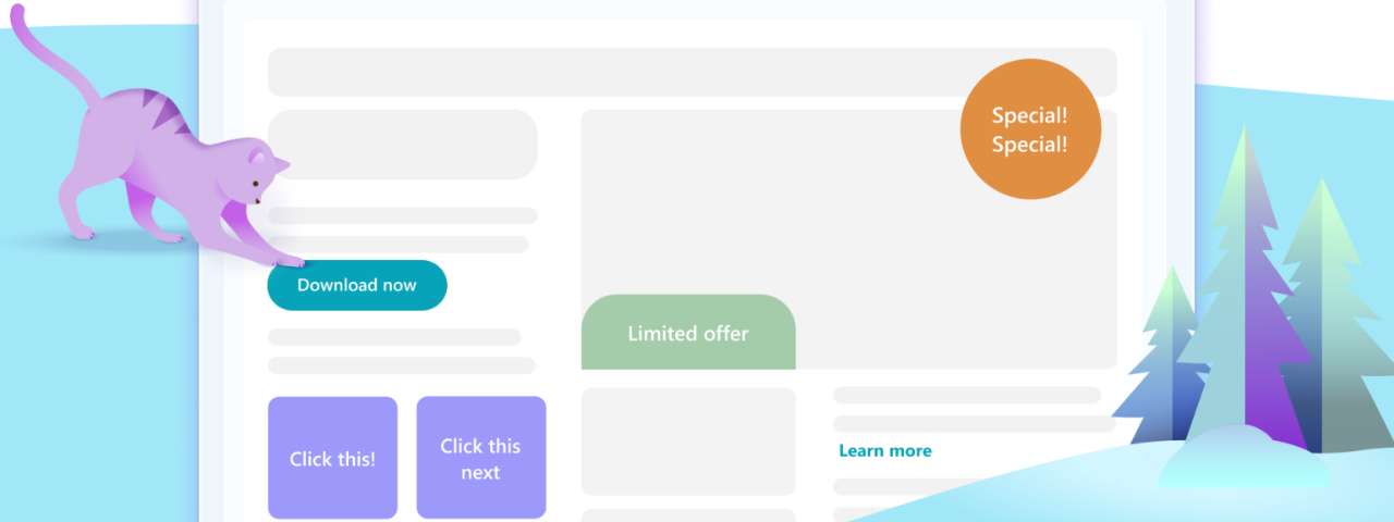
Use High-Contrast Call-to-Action Buttons
Calls to action should stand out clearly from the surrounding layout. Visual contrast helps users identify where they can take the next step without searching.
Contrast does not necessarily mean bright colors. The goal is simply to ensure that the button is visually distinct within the context of the page. Spacing around the button also contributes to its visibility.
The language used within the button should describe the action directly so visitors understand what will happen when they click.
Place CTAs Where User Attention Naturally Goes
The placement of a call to action can influence how often visitors interact with it. Users typically expect to encounter CTAs after they have received enough information to evaluate the product.
Strategic placement throughout the page ensures that visitors can act at different stages of the decision process. Some may click early after seeing the headline and imagery, while others may require more detailed explanations before taking action.
Design With a Clear Visual Flow
A well structured landing page guides visitors through a narrative sequence. The page introduces the product, explains why it matters, provides evidence or reassurance, and then encourages action.
Visual flow helps maintain this progression. Images, section spacing, and typography all contribute to how the information unfolds across the page. When this flow aligns with the decision process of the user, the experience feels coherent and engaging.
Highlight Trust Signals in Strategic Areas
Trust signals in ecommerce, such as reviews, guarantees, and payment security indicators reduce uncertainty during the buying process. These elements reassure visitors that the store is reliable and that the purchase carries minimal risk.
Instead of isolating trust signals in a single section, high-converting landing pages integrate them near decision points. Placing reviews close to the call to action, for example, reinforces confidence at the moment when visitors consider purchasing.
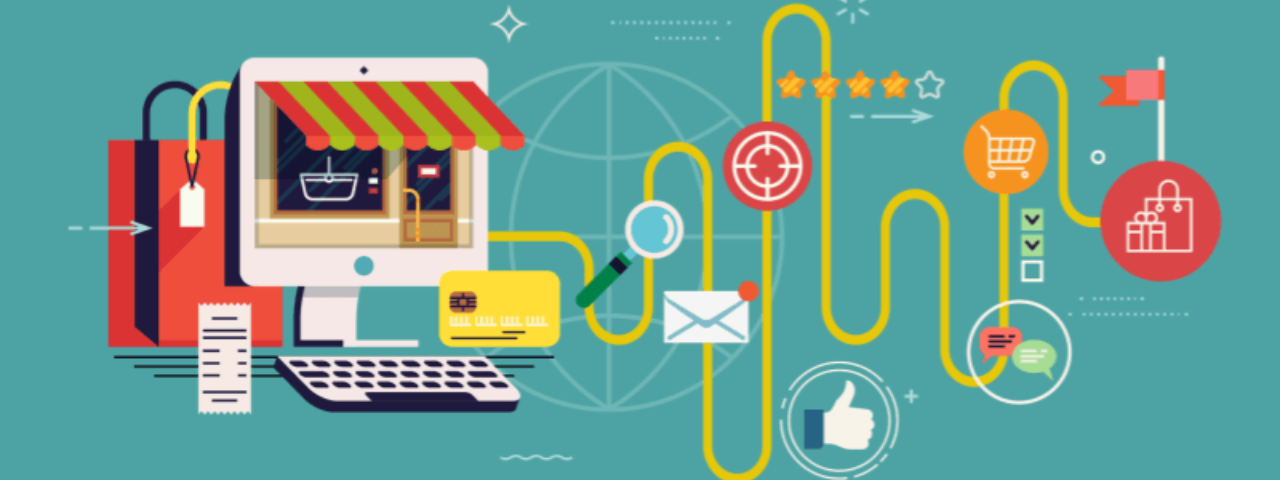
How Product Images and Visual Content Influence Purchase Decisions
In ecommerce environments where visitors cannot physically interact with products, visual content becomes the primary way to evaluate quality and functionality.
Use High-Quality Product Images to Increase Perceived Value
Detailed imagery allows visitors to inspect materials, textures, and design features. These visual cues help users estimate the quality of the product and determine whether it meets their expectations.
High-resolution images also signal professionalism and reinforce the perception that the brand takes its presentation seriously.
Show Products in Context With Lifestyle Images
Lifestyle imagery places the product within a realistic environment. This context helps visitors imagine how the product might fit into their daily lives. For categories such as apparel, home goods, or wellness products, contextual imagery often communicates value more effectively than isolated product photos alone.
Add Product Videos or Demonstrations to Boost Engagement
Video demonstrations provide additional clarity by showing how a product works or how it can be used. Motion allows users to understand functionality and scale in ways that static images cannot fully convey.
Short demonstration videos frequently increase engagement because they answer questions that visitors might otherwise have to infer.
Optimize Images for Speed and SEO
Visual content must be balanced with performance considerations. Large image files can significantly slow page loading, which negatively affects both user experience and search rankings.
Image compression, modern formats, and descriptive alt text help maintain visual quality while improving page speed and SEO performance.
This becomes especially important in ecommerce, where image-heavy pages can quickly impact performance. Ecommerce image optimization, including file formats, compression, and responsive sizing, directly influences load speed, user experience, and search visibility.
Making the Buying Journey Simple and Frictionless
Visual design and user experience are closely related. A page may look attractive but still feel difficult to navigate if its structure does not support the user’s goals.
Effective UX design focuses on reducing obstacles that prevent visitors from progressing toward purchase.
Simplify Navigation to Guide Users Toward Conversion
Landing pages typically have a single primary objective.
Navigation should support this goal rather than distract from it. Reducing unnecessary links or competing elements helps keep attention focused on the product and the conversion action.
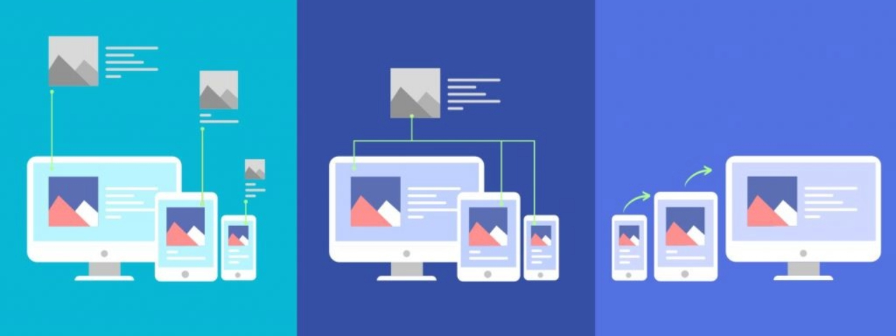
Design Mobile-First Experiences
Mobile traffic now represents a large share of ecommerce visits. Pages must therefore function effectively on smaller screens.
Mobile-first design encourages simpler layouts, clearer typography, and more accessible interactive elements. These adjustments improve usability across all devices.
Balance Visual Quality With Page Speed
Even well designed pages lose effectiveness if they load slowly. Visitors expect fast responses when navigating ecommerce sites.
Optimizing scripts, compressing images, and minimizing unnecessary elements helps maintain fast loading times without sacrificing visual quality.
Measuring the Impact of Design With A/B Testing
Design improvements should be evaluated through measurable outcomes rather than subjective preference. A/B testing allows teams to compare variations of a page element and observe how user behavior changes.
Test Different CTA Styles and Placements
Small adjustments to button color, text, or placement can influence how often visitors click. Testing these variations helps identify which design encourages stronger engagement.
Experiment With Layout and Visual Hierarchy
Changes to section order, spacing, or imagery may affect how visitors interpret the page. Testing layout variations reveals how these structural adjustments influence conversion behavior.
Focus on the Metrics That Matter for Ecommerce
Several metrics provide insight into landing page performance. Click-through rate reflects engagement with calls to action. Bounce rate indicates whether visitors remain on the page long enough to explore the content.
Conversion rate ultimately measures how many users complete the intended purchase action.
Monitoring these metrics allows teams to evaluate design decisions based on real outcomes rather than assumptions.
Best Practices to Continuously Improve Your Ecommerce Landing Page Design
Ecommerce landing page optimization is not a single project. As customer expectations evolve and product offerings change, design decisions should be revisited regularly.
Simplifying layouts, maintaining clear calls to action, integrating trust signals, and prioritizing mobile usability all contribute to stronger performance. Continuous testing and iteration help refine these elements over time.
When design is treated as a performance discipline rather than a static asset, ecommerce teams gain a powerful tool for improving both user experience and revenue.
Final Thoughts
The design of an ecommerce landing page influences how visitors perceive the brand, how easily they understand the product, and how comfortable they feel completing a purchase.
Pages that prioritize clarity, structure, and usability reduce friction in the buying journey and help users move toward conversion with greater confidence.
For brands focused on growth, improving visual design is often one of the most practical steps toward better performance.
By aligning layout, imagery, and user experience with the decision process of the customer, landing pages evolve beyond attractive interfaces, becoming powerful tools that guide attention, build trust, and increasing ecommerce conversions.