


Product detail pages are the point where every effort in e-commerce either pays off, or collapses. They are where traffic becomes revenue, where expectations become decisions, and where every friction point is amplified. PDPs are often treated like static templates that need only beautiful images and a clean layout.
The truth is different. High-converting product pages are systems that depend on four disciplines working together: CRO, SEO, UX, and development.
Brands aiming to scale usually try to improve results by investing in one of these areas at a time. That’s why gains tend to be incremental instead of transformative.
A product page cannot become a revenue engine if it is optimized in silos. It works only when acquisition, user behavior, and technology move in the same direction.
This systemic view of a product page also connects directly to how brands validate improvements. Effective A/B testing for ecommerce allows teams to evaluate which parts of the system create real impact, instead of relying on isolated assumptions.
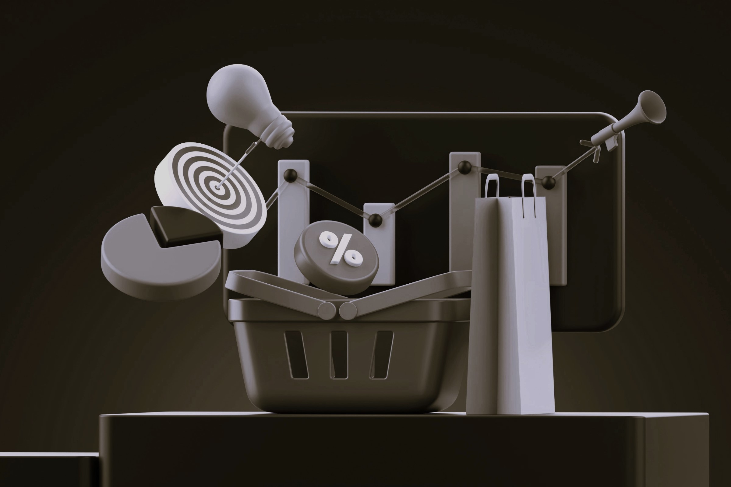
The Product Page as a System (SEO + UX + CRO + Development)
A product page is not a layout. It’s a system of information, intention, expectation, and decision-making.
Every visitor arrives with a question:
Is this the right product for me?
The role of your page is to answer that question with clarity and confidence.
Each discipline contributes something different.
SEO ensures that the right user, someone actively searching for what you offer, reaches your page. Strong SEO strategies for ecommerce help attract visitors whose intent already aligns with your product.
UX is responsible for shaping how users read, compare, and evaluate information. Understanding the UX essentials every ecommerce store needs helps teams structure product pages in a way that reduces friction and accelerates decision-making.
CRO removes hesitation. With the support of proven CRO frameworks for high-converting product pages, the content is structured to build momentum toward a decision.
Development ties everything together. Solid ecommerce development practices keep the experience fast, stable, and technically reliable.
When they work together, conversion rate, AOV, RPV, and bounce rate shift in predictable, measurable ways. When one discipline is missing, growth plateaus.
Why Optimizing Only One Pillar Limits Growth
Traffic alone doesn’t convert, even if it’s extremely well-targeted.
Without clarity or persuasive structure, users drift. This is where strong Shopify performance optimization becomes essential, because poor speed or instability weakens every other improvement.
SEO can place a user on the page, but without UX clarity or CRO structure, they drift. On the other hand, a beautifully designed PDP cannot scale if the keywords it ranks for attract the wrong intent. And even the best hypothesis in a CRO roadmap means nothing if the development layer cannot support testing or if performance degrades after every update.
- SEO improvements lose their impact when users land on pages that don’t clearly communicate value or guide the purchase decision.
- UX refinements become irrelevant if the traffic coming in has low buying intent or cannot find the page in the first place.
- CRO testing stalls when the development layer cannot support fast iteration, stable performance, or scalable architecture.
- Strong design work underperforms when it’s not paired with structured SEO signals, loading efficiency, or a persuasive decision-making flow.
- Performance issues cancel out gains from UX, CRO, and SEO since slow pages increase abandonment across all acquisition channels.
Growth is not the result of fixing one piece. It is the outcome of aligning all of them.
Many brands try to scale using rigid or generic templates, but high-performing PDPs often require deeper structural adjustments. This is where custom Shopify solutions become essential for supporting advanced UX, CRO, and SEO requirements across the product page system.
User Experience and Its Direct Impact on Conversions
Optimizing user experience on a product page is not about aesthetics. It is about decision architecture. You’re designing the path a user follows from curiosity to commitment.
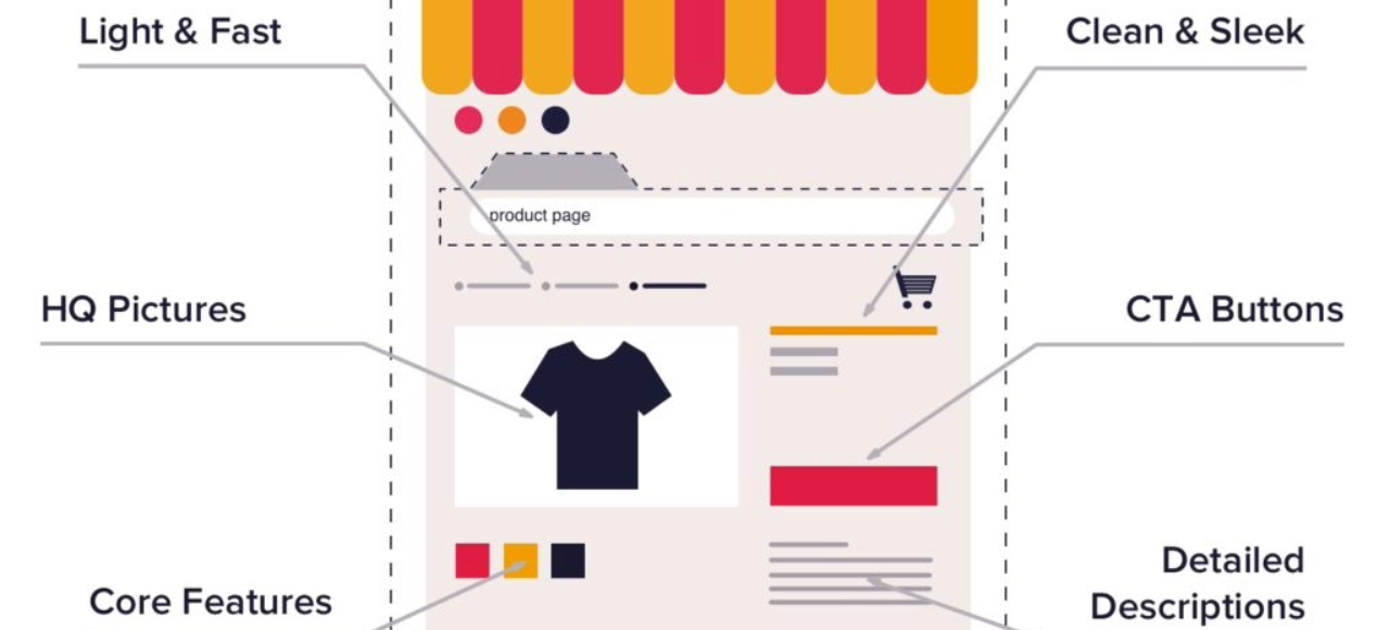
Intuitive Navigation and Information Hierarchy
A high-converting product page prioritizes scannability. Users should understand what the product is, why it matters, and whether it meets their needs within seconds. A strong hierarchy guides attention from the core value proposition to features, benefits, reviews, and purchasing options.
When information is in the wrong order, the cognitive effort increases and decision-making stalls. The best PDPs reduce interpretation and let the user absorb content in a natural sequence.
Visual Elements That Accelerate Purchase Decisions
Images carry the weight of tangibility. A gallery built only with static, isolated shots underperforms because it asks the user to imagine how the product works.
Lifestyle images, demos, zoomable photos, and short videos reduce uncertainty.
They answer the unspoken questions: How big is it? How does it feel? How does it look in real life?
Strong PDPs compensate for the absence of physical contact with visual clarity and sensory detail.
But visuals alone aren’t enough. They need to load smoothly and appear in a sequence that feels deliberate. A well-structured site architecture supports this by ensuring media, content blocks, and product information work together instead of competing for attention.
Performance and Page Load Time
People abandon slow pages even when they want the product. A one-second delay can reduce conversion rates by several percentage points. Performance is not a technical bonus. It is a decision factor. It also directly influences SEO visibility, especially on mobile.
Google’s Core Web Vitals have made performance inseparable from ranking and user experience. Brands treating load time as a secondary concern are leaving revenue on the table.
Mobile-First Is Not Adaptation, It’s Priority
Most e-commerce traffic comes from mobile, yet many PDPs still begin with desktop thinking.
A mobile-first PDP is not a resized version of a desktop layout. It is designed around thumb behavior, limited attention, varied lighting, and one-handed navigation.
Clear CTAs above the fold, concise copy, and frictionless interaction are essential. Responsive design solves formatting and mobile optimization solves conversion.
CTA Placement and Purchase Flow
Calls to action should guide, not interrupt, the user's momentum. Strong PDPs place CTAs where the user naturally expects them, repeating them at logical points in the decision flow. They avoid clutter near the buy button and remove anything that competes with the primary action. CRO begins with understanding how users behave and structuring CTAs accordingly.
SEO as the Foundation of Visibility and Conversion
Search traffic only becomes revenue when two conditions are met:
- People can find your product page, and
- The query that brought them there matches what you sell.
SEO for product pages goes beyond generating impressions. It aligns search intent with the product’s value proposition and establishes a structure that supports both discoverability and conversion.
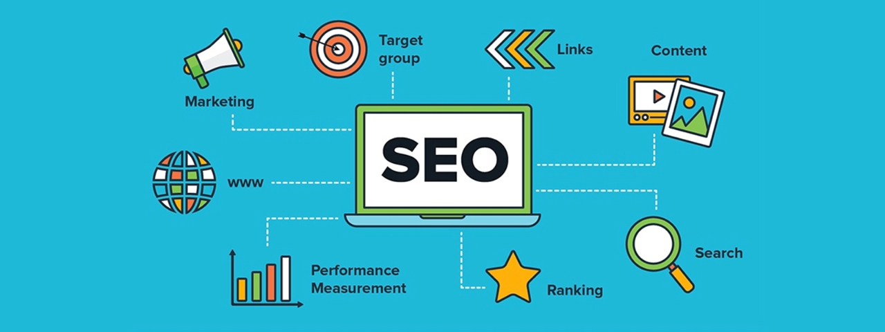
When SEO is treated as a revenue discipline rather than a visibility exercise, product pages attract visitors who arrive with clear expectations and stronger buying signals.
On-Page SEO Applied to Product Pages
Search engines and users evaluate product pages in parallel. Metadata and headers help search engines determine relevance, but they also shape the user’s first impression on the SERP and their reading path on the page.
Titles should mirror real-world search patterns, incorporating descriptors that reflect how shoppers compare products.
Meta descriptions work best when they act as a compact summary of the offer, value proposition, differentiators, delivery expectations.
Headers guide the user through the story of the product, breaking the content into a logical sequence that supports skimmability and prevents overwhelm. Strong on-page structure improves both ranking stability and user comprehension, which directly affects conversion rates.
Purchase-Intent Keywords and Their Impact on Product Page Performance
Not all organic traffic behaves the same way. Queries that indicate research or comparison bring users who are still evaluating. Queries that indicate intent generate buyers.
The difference is measurable, and integrating ecommerce keyword analysis helps product pages align more precisely with these high-intent terms. Searchers who include modifiers such as “buy,” “best price,” “near me,” “review,” or specific model variations show stronger commercial readiness.
Product pages aligned with these terms typically see:
- Higher click-through rates, because the SERP result clearly reflects the intent behind the query.
- Lower bounce rates, because the landing page matches what the user expected to find.
- Higher conversion rates, because the user arrives with the goal of validating a purchase decision rather than learning about a category.
This is why SEO for product pages must prioritize transactional intent over volume-driven keyword selection.
Structured Data (Schema Markup) for Product Pages
Schema is one of the rare SEO initiatives that improves both organic visibility and conversion performance simultaneously. It helps search engines extract precise data, price, availability, variants, ratings, and display it directly on the results page.
When schema is correctly implemented:
- CTR increases, because rich results stand out visually.
- Users arrive more qualified, since they already saw essential details before clicking.
- Conversion improves, because the page fulfills the expectations created on the SERP.
Schema also supports indexation, allowing search engines to better understand product variations and relationships within your catalog. For large e-commerce sites, this structure becomes a competitive advantage.
Reviews and Social Proof as Search and Conversion Signals
Reviews influence both discoverability and decision-making. They expand the semantic footprint of a product page, improve ecommerce trust , directly improving how confidently shoppers move toward a purchase, and strengthen user engagement, three factors that contribute to better organic performance.
- Search engines treat consistent user-generated content as an indicator of relevance, which can lead to improved visibility for long-tail queries and attribute-based searches.
- High-quality review content reduces friction at the bottom of the funnel by addressing uncertainties, fit, use cases, durability, using language that resonates with actual buyers.
When reviews are structured, easy to filter, and visually integrated near key decision points, they have measurable impact on conversion rates.
Development as the Invisible Pillar of CRO and SEO
A high-converting product page depends on development decisions that most users never see but experience in every interaction.
Performance, data accuracy, testing capability, URL behavior, content rendering, and variant logic all originate in the development layer.
When this foundation is weak, even the strongest SEO or CRO strategy loses power. When it’s strong, the page becomes faster, clearer, more indexable, and far easier to optimize over time.
Development Best Practices and Performance
Performance is a measurable asset. Every millisecond added to load time affects engagement, conversion, and organic visibility. Development teams influence this through the architecture of the site, the weight of scripts, and the efficiency of how assets are delivered.
Key development decisions that directly affect PDP performance:
- How JavaScript loads: asynchronous loading, tree-shaking, and minimizing render-blocking scripts stabilize the layout and reduce Time to Interactive.
- Image optimization: WebP or AVIF formats, responsive image sets, and lazy loading improve both mobile and desktop experience without sacrificing quality.
- CSS organization: modular styles reduce unused code and improve CLS (Cumulative Layout Shift), a Core Web Vitals component tied to both ranking and usability.
These optimizations are not optional add-ons. They determine how fluid the user journey feels and whether search engines consider the page competitive.
Technical SEO on Product Pages
Technical SEO is where development decisions translate directly into search visibility. A product page becomes easier for search engines to interpret when its structure is predictable, its URLs reflect the catalog logic, and its variants are handled in a way that avoids duplication.
Canonical tags reinforce which version of a page should hold authority, while internal linking guides crawlers through the site in a coherent path that strengthens indexation and distributes relevance across the catalog.
When these elements work together, search engines gain a clear understanding of how products are organized, which queries they should match, and how often they should appear in results.
For brands managing dozens or hundreds of SKUs, this technical foundation is what keeps the catalog visible, crawlable, and competitive as it scales.
A/B Testing and Personalization at Scale
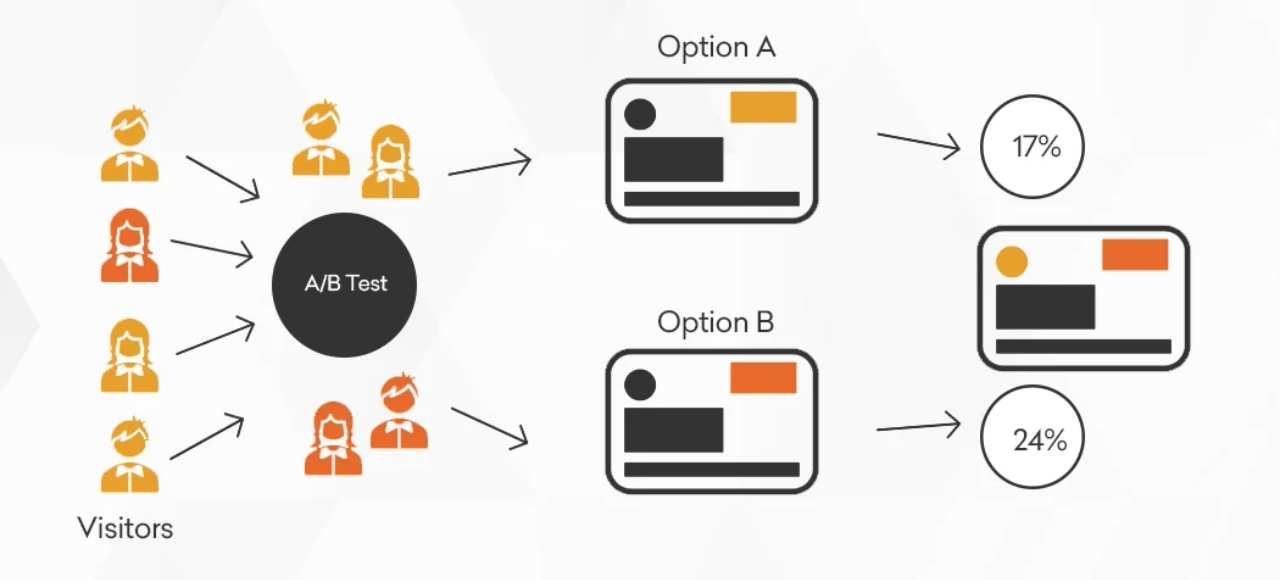
CRO requires a development foundation that allows rapid experimentation without jeopardizing stability or performance. A site with rigid templates or tightly coupled components makes testing slow and error-prone.
In contrast, modular architecture allows teams to adjust layouts, messaging, CTAs, or media assets in controlled environments. The reliability of testing also depends on how scripts load and how interactions are tracked. If performance degrades the moment an experiment is launched, the results become unreliable.
Personalization introduces similar challenges. It depends on conditional rendering, dynamic content injection, and user segmentation, all of which must be implemented in a way that preserves speed and avoids flicker effects. Development makes testing and personalization feasible; without it, CRO becomes a set of ideas that cannot be validated.
Behavioral Analytics Tool Integration
Analytics tools reveal the gap between expected behavior and actual behavior. Development determines the accuracy, continuity, and granularity of this data.
High-value integrations require:
- Consistent tagging frameworks, so that funnels, events, and conversions align across Google Analytics, heatmaps, and attribution tools.
- Session replay hygiene, where scripts are loaded in a way that doesn’t slow down rendering or interfere with interactive elements.
- Server-side tracking where appropriate, improving data reliability as browsers restrict cookies and client-side tracking.
The value does not come from the tools themselves but from how precisely they capture behavior. Without clean implementation, insights become unreliable, and optimization becomes guesswork.
Social Proof, Trust, and Urgency on Product Pages
People buy when they trust the brand and believe the product meets their needs better than alternatives.

Reviews, Testimonials, and Social Validation
Quantity matters. Quality matters more. Specific reviews, those describing the problem, the hesitation, and the outcome, act as micro case studies. They reduce perceived risk and answer objections in the customer’s own words.
Scarcity and Urgency Without Manipulation
The goal is clarity, not pressure. Real-time inventory, delivery estimates, or transparent timelines can accelerate decisions in a natural way. Users respond to honest context more than fabricated urgency.
Guarantees, Returns, and Clear Policies
One of the fastest ways to increase conversions is to remove ambiguity around returns and guarantees. Confidence in post-purchase experience influences pre-purchase behavior.
CTAs: The Final Conversion Point
A call to action is more than a button. It represents the moment when the user decides whether everything they have read, seen, and evaluated adds up to enough certainty to move forward. When a CTA works well, it feels like the natural continuation of the buying journey, not a separate interruption.
Designing CTAs That Guide Rather Than Push
The highest-performing CTAs don’t shout. They stand out through clarity and contrast, but they remain grounded in the overall design language of the page. A good CTA is immediately visible without competing against other visual elements. This balance ensures that the user always knows where the next step is, especially on mobile, where scanning behavior is fast and attention shifts often.
Placement also plays a defining role. CTAs need to appear at the moments when the user has gathered enough information to feel confident, near pricing, after digesting benefits, and again once social proof reinforces credibility. Strategically repeated CTAs reduce the distance between intention and action.
How Timing and Context Strengthen Commitment
Users don’t respond to pressure, but they do respond to clarity. Delivery timelines, return policies, and real inventory levels reduce uncertainty and help the user understand the practical side of their decision.
When CTAs appear alongside useful context, estimated delivery dates, shipping thresholds, limited-run collections, they create a sense of timing that feels informative rather than manipulative. This type of subtle guidance supports conversion because it answers a question most users never verbalize:
Is this the right moment to buy?
Language That Shapes Motivation
When choosing CTA wording, consider how each verb shifts the emotional tone:
- Action verbs that communicate progress or advantage often feel more motivating than administrative phrasing.
- Phrases that highlight the benefit behind the click remind the user of what they gain, not merely what they must do next.
- CTAs tailored to the nature of the product, rather than generic commands, increase relevance and reduce hesitation.
The most effective CTA copy is rarely clever. It is clean, accurate, and aligned with the value the page has already established.
Common Product Page Mistakes (and How to Avoid Them)
Most underperforming product pages do not fail because of a single flaw, they fail because several small weaknesses accumulate and erode user confidence. These issues are common across industries and often appear even in brands with strong products and solid traffic.
Addressing them does not require a full redesign; it requires understanding how each element contributes to decision-making.
The most frequent mistakes include:
- No clear value proposition
Users land on the page but cannot immediately understand what makes the product different or worth purchasing.
When the headline or opening content simply describes the item instead of communicating its primary advantage, visitors move on. A strong PDP clarifies not just what the product is, but why it is the best choice in its category. - Sparse or generic social proof
Reviews that are vague, outdated, or difficult to browse offer little support to the decision process.
High-converting pages use reviews as a structured conversation that answers objections, highlights real use cases, and reflects diverse customer experiences. Social proof is most effective when it acts as a continuation of the product story. - Complex or confusing checkout path
Friction rarely appears in dramatic ways. It often shows up through small inconsistencies, unclear steps, unnecessary fields, or interruptions between “Add to Cart” and confirmation.
These micro-obstacles increase abandonment, especially on mobile. Streamlined flows and predictable transitions significantly reduce drop-off. - Weak mobile presentation
A layout that looks acceptable on mobile but does not function like a mobile-first experience loses users quickly.
Dense text, small tap targets, hidden CTAs, or oversized media slow the path to action. A mobile PDP should be optimized for thumb navigation, rapid scanning, and clear prioritization of the most important elements. - CTAs that blend into the layout
CTAs that lack contrast or do not visually “anchor” the page fail to guide behavior. Users should never wonder how to proceed; the CTA should be the most visible and stable interface element.
When CTAs are visually lost or inconsistently placed, even motivated shoppers hesitate.
Avoiding these issues often produces noticeable conversion lifts without changing the core design. The goal is not to reinvent the page, but to remove the obstacles that interrupt the decision-making flow.
Conclusion
A high-converting product page is the result of synchronizing CRO, SEO, UX, and development into a single strategic system. Growth becomes consistent only when these elements reinforce each other. Treating them as independent disciplines limits both scalability and resilience.
Brands that invest in integrated PDP optimization create long-term advantages: more qualified traffic, stronger user engagement, and higher conversion rates across all channels.
To explore more insights on e-commerce growth, CRO, SEO, and UX strategy, visit the Vasta website and follow our CEO, Igor Silva, on Instagram for weekly breakdowns and practical frameworks designed for brands ready to scale.