

Ask someone why one e-commerce landing page converts while another, selling the same type of product to the same audience, falls flat, and the answers are usually surface-level.
Design comes up first. Then copy. Then trust badges, testimonials, or page speed.
All visible components. All incomplete explanations.
High-performing landing pages don’t win because of isolated elements. They win because every part of the page works together to support a single decision the visitor is already leaning toward making.
Nothing competes for attention. Nothing asks for unnecessary interpretation. The page doesn’t try to convince, it clarifies.
Most landing pages fail for the opposite reason. They scatter attention, mix messages, and force visitors to think instead of decide. The result isn’t rejection, it’s hesitation. And hesitation is the silent killer of conversion.
When a landing page works, the experience feels effortless. The message makes sense immediately. The next step feels obvious. Trust builds without being announced.
By the time the user acts, the decision feels less like a leap and more like a natural continuation of intent.
That difference, between friction and flow, is where conversion is actually decided.
The Real Job of an E-commerce Landing Page
A landing page exists to do one thing exceptionally well: eliminate uncertainty at the exact moment a user is closest to acting.
Unlike other pages in an e-commerce experience, it is not designed to support multiple journeys or open-ended exploration. It is built for a specific entry point, a specific mindset, and a specific outcome.
Understanding this role is the difference between building pages that look polished and building pages that actually convert.
Why a Landing Page Is Not “Just Another Page”
A landing page is not a smaller homepage.
It’s not a prettier product page.
And it’s definitely not an information dump.
A landing page is a decision accelerator.
Its job is not to educate broadly, it’s to compress the path from intent to action. That compression is where conversion happens.
The mistake many brands make is assuming that more information equals more confidence. In reality, more information often creates more decisions, and every extra decision introduces friction.
High-performing landing pages don’t try to answer everything.
They answer the one question the user needs answered to move forward.
Landing Pages as Conversion Shortcuts
Landing pages convert because they remove unnecessary decisions.
They guide instead of letting users browse.
They prioritize instead of offering options.
This is why landing pages often outperform category pages and PDPs for paid traffic, launches, or focused campaigns. Categories are designed for exploration. PDPs support comparison and reassurance. Landing pages are built for resolution.
When the user doesn’t need to decide where to go next, they can focus on deciding whether to act.
Landing Page vs. Product Page: Same Elements, Different Purpose
What a Product Page Is Designed to Do
A product page supports:
- Exploration
- Comparison
- Reassurance
It assumes uncertainty. It gives users multiple paths because it doesn’t know exactly where they are in the decision process.
That’s a strength, for organic browsing and discovery.
It’s a weakness when traffic already has intent.
What a Landing Page Is Designed to Do
A landing page is built for:
- One audience
- One promise
- One action
Focus is not a design preference, it’s the highest-converting feature.
Every element exists to move the user toward a single outcome. Anything that doesn’t serve that outcome is friction, even if it looks “helpful.”
How Mixing These Roles Kills Conversion
A common CRO mistake is using hybrid pages, product pages treated like landing pages.
These pages retain navigation menus, cross-sells, related products, and multiple CTAs, while being sent traffic that expects a clear and direct path forward. Each additional option introduces a decision. Each decision adds friction at the exact moment focus matters most.
Product pages are designed to support comparison and exploration.
Landing pages are designed to drive resolution.
When a single page tries to do both, it often slows decision-making instead of accelerating it. For high-intent or campaign-driven traffic, that mismatch quietly suppresses conversion.
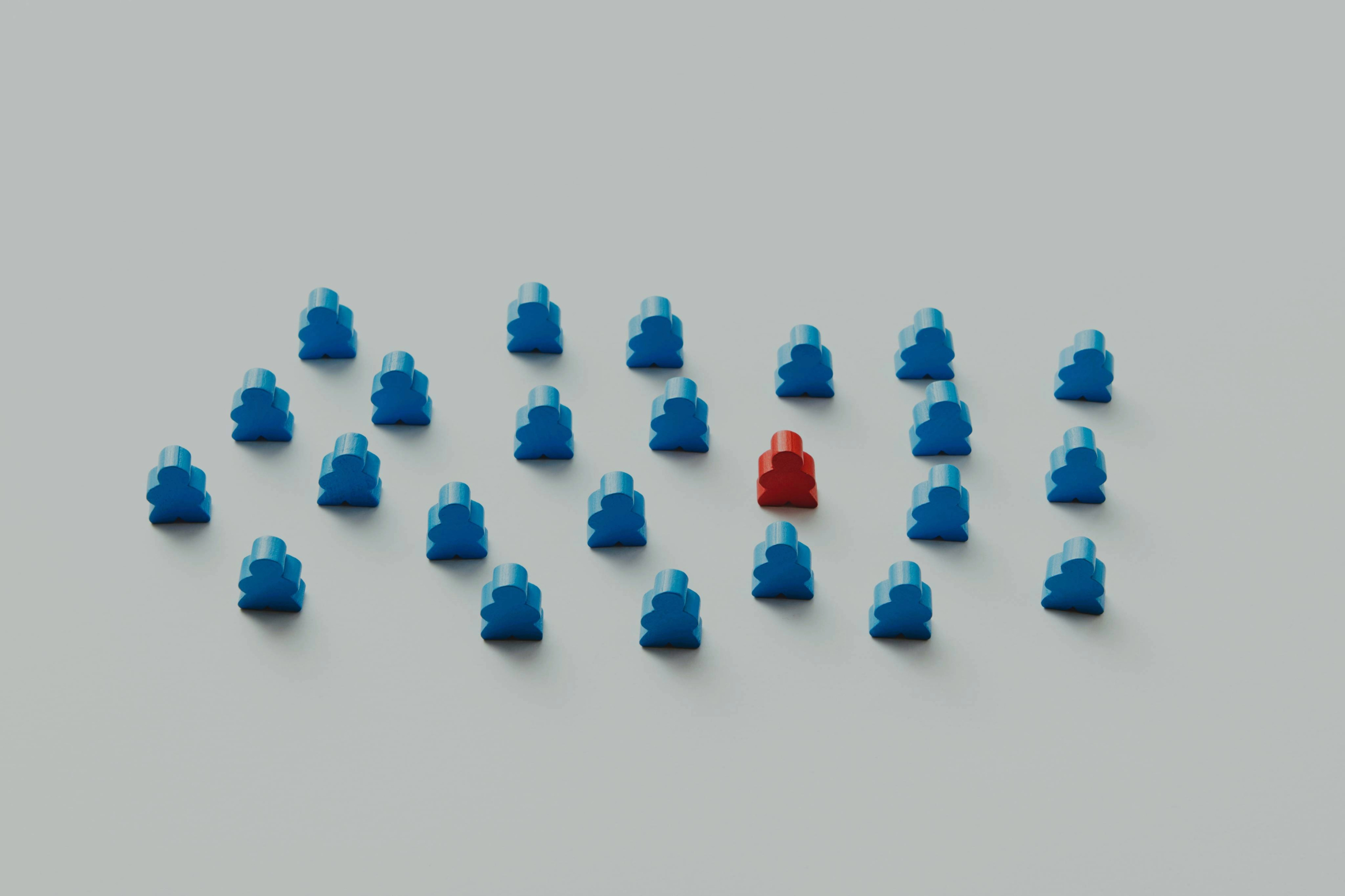
User Intent Is the Invisible Architecture of Every Landing Page
Every landing page is built on an assumption about why the visitor arrived. That assumption shapes how much explanation is needed, how quickly trust must be established, and how direct the call to action can be.
When intent is correctly understood, the page feels intuitive and easy to move through. When it’s misread, even well-designed pages feel awkward, confusing, or prematurely aggressive, and conversion quietly suffers.
Why Intent Comes Before Layout
Landing pages rarely fail because of poor design. They fail because the page is built without a clear understanding of the visitor’s state of mind.
Every visitor arrives with an internal question already forming:
Is this relevant? Is this for me? Is this worth my attention right now? If the page doesn’t answer that question immediately, visual polish and clever copy stop mattering. Design supports conversion only after relevance is established.
Cold, Warm, and Hot Traffic: Same Page, Different Outcome
User intent determines how much explanation, proof, and direction a page needs.
High-intent visitors already understand the problem and are close to acting. They respond best to clarity, speed, and a direct path forward. Cold traffic, on the other hand, arrives with uncertainty. Without context, even a well-designed page can feel abrupt or overly aggressive.
A simple rule applies: the lower the intent, the more work the page must do to orient the user before asking for action.
“Landing pages don’t convert because they’re beautiful, they convert because they answer the right question at the right moment.”
When intent is ignored, pages often look impressive but underperform. The issue isn’t execution, it’s misalignment between why the user arrived and what the page asks them to do.
Clarity Beats Creativity in High-Converting Landing Pages
Conversion-focused landing pages are not judged by how impressive they look, but by how quickly they make sense.
Clarity reduces effort, and effort is one of the strongest predictors of abandonment. When users don’t need to interpret the page, compare options, or decode the message, they move forward with less resistance, and conversion improves as a result.
The Cost of Cognitive Load
Users don’t read landing pages.
They scan decisions.
Every moment of confusion shows up as bounce rate, hesitation, or drop-off. When users can’t immediately understand:
- What this is
- Who it’s for
- Why it matters
They leave, not because they’re uninterested, but because the cost of figuring it out feels too high.
Visual Hierarchy as Silent Persuasion
Visual hierarchy determines what users notice first, second, and not at all. Spacing signals importance, contrast creates focus, and sequencing establishes a natural decision flow. When hierarchy is clear, users don’t feel guided, they simply feel oriented.
High-converting landing pages make the primary action visually dominant without announcing it. If a CTA has to be searched for, or competes visually with secondary elements, friction has already been introduced.
One Page, One Action
Secondary CTAs rarely fail because they’re bad ideas, they fail because they divide attention. Each additional option introduces a pause, and pauses weaken momentum.
Removing options doesn’t force users to act. It removes unnecessary decisions at the moment commitment is required. In practice, pages optimized around a single action consistently outperform those that attempt to be flexible or accommodating.
Message, Value Proposition, and CTA Must Say the Same Thing
Conversion increases when the promise, the explanation, and the action all reinforce the same outcome. When these elements drift, even subtly, users sense inconsistency and hesitate.
High-performing landing pages feel coherent because nothing contradicts the expectation set moments earlier, and the next step always feels like the natural conclusion of the message.
What a Strong Value Proposition Really Is
A strong value proposition reduces uncertainty by being specific. It tells users exactly what changes for them, not how impressive the brand sounds.
Terms like “premium,” “high quality,” or “best in class” ask users to fill in the blanks themselves. That guesswork increases perceived risk. Specific promises, clear outcomes, timeframes, or use cases, make the decision feel safer because the value is easier to evaluate.
Message Match: Ad → Landing Page → Action
Trust is fragile, especially with paid traffic.
When an ad frames a problem one way and the landing page reframes it differently, users feel the disconnect immediately.
Even strong copy fails when the context shifts.
High-converting landing pages don’t restart the conversation, they continue it, reinforcing the same promise all the way through to the action.
Why Generic CTAs Underperform
“Buy now” communicates urgency, but not value.
Contextual CTAs work better because they describe the outcome of the click, not just the action. They reduce hesitation by making the next step feel predictable and low-risk. The more clearly a CTA reinforces what the user gains, the less mental effort it takes to move forward.
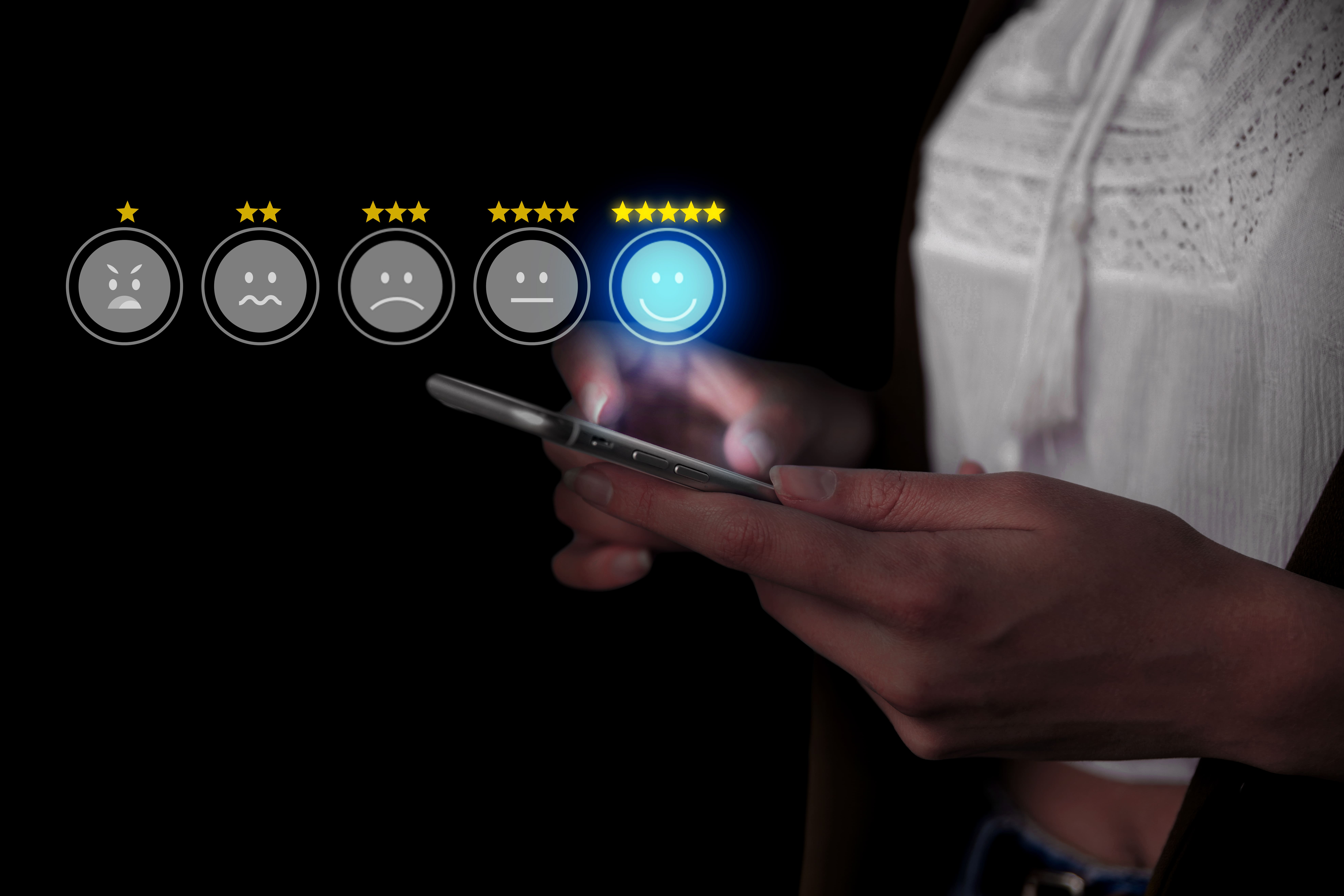
Trust and Risk Reduction: The Hidden Conversion Multipliers
Conversion decisions are rarely blocked by lack of desire. They’re blocked by unresolved risk.
Effective landing pages anticipate where doubt will surface and address it before the user feels the need to stop, scroll back, or leave. When trust is handled correctly, it doesn’t feel persuasive, it feels reassuring.
Why Trust Is Not a Section, It’s a Layer
Trust isn’t something to be added at the bottom of a page as reassurance. It works best when it appears at the exact moment a question forms. When trust elements are layered alongside claims, prices, or CTAs, they reduce friction before it turns into hesitation.
Social Proof That Actually Works
The impact of social proof depends more on relevance than volume. Proof converts when users can see themselves reflected in it:
- Testimonials that match the visitor’s situation or intent
- Metrics that reinforce the specific outcome being promised
- Logos or brands that signal familiarity or legitimacy
Large quantities of generic proof often feel decorative. Targeted proof feels reassuring.
Guarantees, Policies, and Safety Signals
Reassurance accelerates decisions by lowering perceived risk. Clear guarantees, transparent policies, and visible safety signals shorten the decision loop by answering objections before they’re consciously formed. When these elements appear too late, users have often already paused, and momentum is lost.
Why Most E-commerce Landing Pages Underperform
Most landing pages don’t fail in obvious ways. Nothing is technically “wrong.” The design looks fine. The copy sounds reasonable. And yet conversion stalls.
The issue is rarely a single flaw. It’s the accumulation of small moments where the page asks the user to pause, interpret, or second-guess. Each moment adds friction. Enough friction, and momentum disappears.
.webp)
Too Much Information vs. Too Little Meaning
Minimalism is often mistaken for clarity.
Removing content can reduce noise, but it can also remove context.
When key questions go unanswered, confidence drops. Users aren’t looking for more words, they’re looking for reassurance that they understand what’s being offered and why it matters.
High-converting landing pages include only what supports the decision at hand. Nothing more. Nothing less.
Vague Messaging and Weak Offers
“Natural.”
“Effective.”
“Designed for you.”
These phrases sound safe because they commit to very little. The problem is that they leave users doing the work of interpretation.
When outcomes aren’t clearly defined, users must imagine what success looks like on their own. That uncertainty increases perceived risk, especially for first-time buyers. Specificity makes value tangible, and tangible value feels safer to act on.
CTA Confusion and Misplacement
Many conversions are lost at the final step.
Not because users are unconvinced, but because the next action isn’t immediately clear. Weak visual hierarchy, ambiguous wording, or CTAs buried among secondary elements introduce hesitation right when commitment should feel easiest.
When the path forward is obvious, action feels natural.
Ad → Landing Page Disconnect
Landing pages don’t operate in isolation.
Every click carries an expectation. If the page doesn’t immediately reinforce the promise that earned that click, trust erodes fast.
Even strong pages struggle when the message shifts between ad and landing experience.
Conversion improves when the entire path, from first impression to final action, feels continuous and aligned.
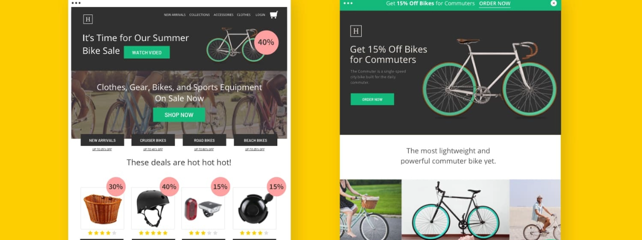
Practical Analysis: What Works (And What Doesn’t)
Example of a High-Converting Landing Page
High-performing pages:
- Match intent immediately
- Make the next step obvious
- Reduce doubt before it forms
When these conditions are met, the experience feels effortless. Users aren’t pushed or persuaded, they’re simply guided.
The page anticipates their questions, answers them in the right order, and makes the decision feel like a natural continuation rather than a commitment leap.
Example of a Low-Converting Landing Page
Low performers introduce friction by:
- Asking users to think too much
- Failing to clarify the promise
- Leaving key questions unanswered
Hesitation in these cases isn’t rejection. It’s unresolved uncertainty. When users have to pause to interpret the message or decide what to do next, momentum breaks, and once it’s gone, conversion rarely recovers.
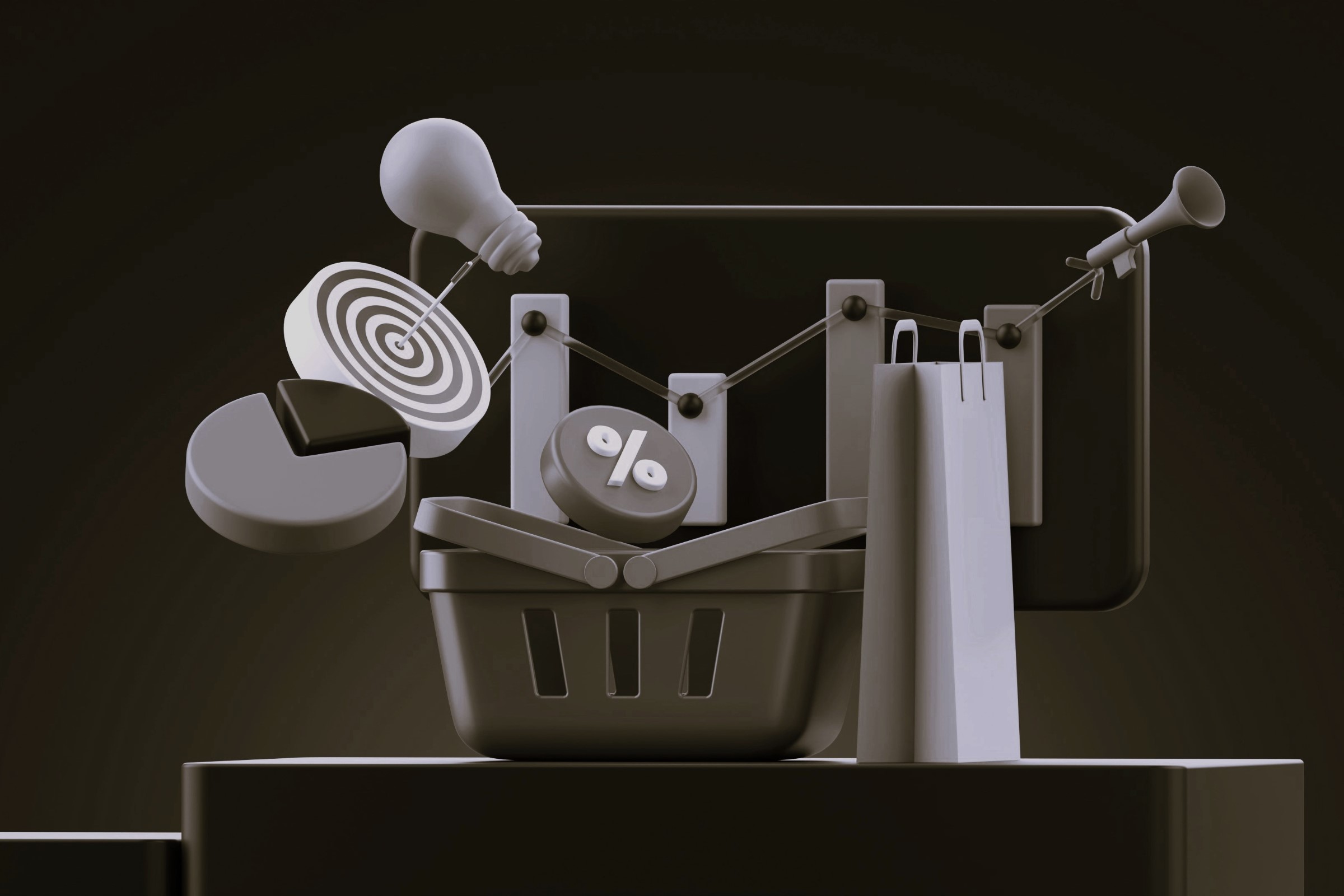
Landing Pages as a Core CRO Lever
Why Landing Pages Are CRO in Its Purest Form
Landing pages are uniquely powerful because they concentrate attention around a single decision. With fewer competing elements, it becomes easier to see how changes in message, structure, or flow influence behavior. This clarity allows teams to identify what truly moves conversion, rather than guessing based on broad site metrics or assumptions.
Because feedback is faster and signals are cleaner, landing pages often become the starting point for meaningful CRO insights across the rest of the site.
Small UX Decisions, Big Revenue Impact
Button placement.
Copy length.
Visual flow.
These choices rarely feel dramatic on their own. But they directly affect how much effort a decision requires. Small amounts of friction accumulate quietly, slowing users down, increasing hesitation, and reducing completion rates. At scale, even minor improvements to these details can translate into significant revenue gains.
How CRO Turns “Good Pages” into Predictable Assets
CRO is not about chasing isolated wins. It’s about building understanding.
By testing clear hypotheses and observing real user behavior, teams learn what consistently reduces friction and increases confidence. Over time, this transforms landing pages from pages that sometimes perform well into dependable assets that support predictable growth.
How to Look at Any Landing Page and Know If It Will Convert
You don’t need heatmaps, tools, or benchmarks to evaluate most landing pages. In many cases, performance can be predicted by how clearly the page communicates its purpose and guides the user forward. When the intent, message, and next step are immediately understandable, conversion has a strong foundation. When they aren’t, friction appears early, and results usually follow.
A Simple Mental Checklist (Without a Checklist)
Instead of evaluating a landing page by design quality or surface elements, start by answering a few foundational questions:
- What question is this page answering right now?
(Price? Fit? Trust? Speed? Outcome?) - Who is it clearly written for?
(New visitor, returning buyer, comparison shopper?) - At what stage of awareness is the user arriving?
(Problem-aware, solution-aware, or ready to act?)
When these answers are obvious, the page feels intuitive. When they aren’t, users hesitate, not because they dislike the offer, but because the page doesn’t meet them where they are.
Thinking Like a User, Not a Designer
Design trends don’t convert, clarity does.
The fastest way to diagnose a landing page is to ignore how it looks and focus on how it feels to move through it. Users aren’t evaluating creativity or structure. They’re subconsciously asking:
- Do I understand this?
- Does this feel relevant to me?
- Is the next step obvious and safe?
When a page answers those questions effortlessly, conversion follows naturally. When it doesn’t, no amount of visual polish can compensate.
Final Thoughts
High-converting landing pages don’t rely on hacks, clever tactics, or isolated optimizations. They work because everything on the page points in the same direction. The message matches the user’s intent. The experience reduces friction. The offer is easy to understand and easy to evaluate.
When alignment is present, conversion feels natural. When it isn’t, users hesitate, not because they lack interest, but because the page fails to support a decision at the moment it matters most.
The real work of optimization isn’t about adding more elements. It’s about removing confusion, resolving doubt, and guiding users with clarity.
If your landing page isn’t converting, is demand really the problem, or is the page asking users to decide without giving them the confidence to do so?
For brands looking to turn clarity into consistent growth, explore Vasta’s CRO, UX, and Shopify development approach, and follow our CEO, Igor Silva, on Instagram and YouTube for practical frameworks and benchmarks drawn from high-performing ecommerce brands.