
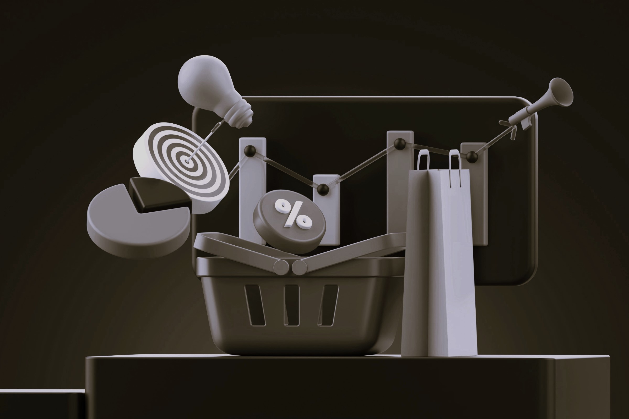


For many ecommerce stores, checkout is seen as a technical formality, a necessary step to complete the purchase. It’s often given little attention once the basics are working: the payment goes through, the cart is clear, and customers can finish their transaction.
But in reality, checkout is where a large portion of sales slips through the cracks.
It’s the most sensitive moment of the customer journey, where shoppers are most ready to buy, but also most vulnerable to abandoning their purchase.
Even the smallest issues in the checkout flow can derail a sale, and many stores fail to realize how much revenue they’re losing at this stage.
Optimizing checkout goes beyond speeding up the process or tweaking individual fields. Checkout performance depends on how effectively friction is removed and how clearly the flow supports a confident purchase decision.
Even small adjustments to the checkout experience can have a disproportionate impact on conversion rates, often delivering faster and more reliable gains than traffic increases or product page changes.
The reality is that checkout is one of the most powerful yet overlooked areas of ecommerce conversion. By strategically optimizing this stage, you can improve revenue without increasing your advertising budget or bringing in more visitors. Instead, you’re simply making the most of the traffic that’s already there.
Why Checkout Is the Most Critical (and Overlooked) Moment in Ecommerce
By the time a shopper reaches checkout, something important has already happened:
They’ve said yes multiple times.
Yes to the product.
Yes to the price.
Yes to the brand.
And yet, this is exactly where most ecommerce stores lose them.
Why?
Because checkout is the moment where desire peaks, and risk perception spikes.
At checkout:
- The emotional excitement of buying collides with rational self-protection
- Doubt quietly re-enters the decision
- The brain switches from exploration mode to evaluation mode
This is why most conversion losses happen after product interest is already high.
From a CRO perspective, checkout isn’t the “last step.”
It’s the conversion bottleneck.
And unlike traffic growth or product page redesigns, checkout optimization often delivers faster ROI because it fixes friction at the moment money actually changes hands.
This is also where effective CRO shifts from isolated tweaks to system-level thinking, understanding how psychology, UX, and flow work together at the most sensitive point of the journey.
Checkout Abandonment Isn’t Random: It’s a Signal
When checkout abandonment appears in analytics, it’s often explained away as a problem of intent. Teams assume the customer wasn’t ready, was price-sensitive, or was simply browsing.
That interpretation is usually incorrect.
By the time a shopper reaches checkout, they’ve already demonstrated intent through a series of deliberate actions: viewing product details, evaluating price, adding items to cart, and initiating the purchase flow.
Abandonment at this stage is rarely accidental or arbitrary. It’s a response to something the system introduces during the checkout process itself.
From a CRO perspective, checkout abandonment is a diagnostic signal. It points to friction, uncertainty, or risk introduced at the exact moment the customer is asked to commit.
The Psychology of Abandonment at the Final Step
Checkout is where decision-making changes. Earlier in the journey, the shopper is comparing, exploring, and imagining ownership. At checkout, the mindset shifts toward risk evaluation and error avoidance.
Several psychological pressures intensify at this point.
- First, the cost of making a mistake feels higher. Entering the wrong address, choosing the wrong size, or missing an important detail now has real consequences. If the checkout flow does not clearly guide the user or allow easy correction, hesitation increases.
- Second, price sensitivity becomes more acute. Even if the product price was accepted earlier, additional costs introduced at checkout, shipping, taxes, delivery fees, trigger loss aversion. The brain reacts more strongly to unexpected costs than to expected ones, even when the total amount remains reasonable.
- Third, cognitive load increases rapidly. Checkout often compresses multiple decisions into a short span of time: personal information, delivery details, payment selection, and confirmation. When too many fields, options, or unclear instructions appear at once, users slow down, make errors, or abandon entirely.
- Finally, trust is tested most severely at the payment moment. Shoppers may trust the product and brand, but payment introduces new concerns: data security, transaction reliability, refunds, and post-purchase support. Any ambiguity here, visual, textual, or functional, raises anxiety.
Individually, these pressures might not stop a purchase. Combined, they compound into hesitation that quietly pushes the shopper toward delay or exit.
Why High Intent Doesn’t Guarantee Conversion
Reaching checkout does not mean the shopper feels confident enough to complete the purchase. High intent only indicates willingness to buy under the right conditions.
Checkout is where rational evaluation and emotional instinct intersect. The shopper may logically want the product while emotionally questioning the risk of completing the transaction. If the checkout flow does not actively reduce uncertainty and support confidence, even motivated users pause.
That pause is measurable. Longer completion times, repeated field errors, form re-edits, and drop-offs at the payment step all indicate friction at work. These behaviors are not signs of disinterest; they are signs that the checkout system is failing to support the decision.
This is why checkout optimization is such a powerful CRO lever. It addresses abandonment caused not by lack of demand, but by avoidable friction introduced at the most sensitive moment of the purchase journey.
Friction at Checkout: What Helps Conversion vs. What Kills It
In checkout CRO, friction is one of the strongest forces influencing conversion. Friction increases the effort, uncertainty, or perceived risk of completing a purchase. When it appears at checkout, it directly interferes with the decision to pay.
Not all friction is harmful. Some forms of friction reduce risk and increase confidence, while others introduce doubt or unnecessary effort.
Useful Friction vs. Useless Friction
Useful friction builds confidence because it clarifies what is happening and why. It reassures the shopper that the transaction is secure, that their information is handled correctly, and that there are no hidden consequences after payment.
Examples include:
- Security confirmations that signal a protected transaction
- Clear explanations that justify why certain information is required
- Reassurance about next steps, such as order confirmation or delivery timing
Useless friction creates doubt because it adds effort without providing clarity or reassurance. It forces the shopper to slow down, question the process, or solve problems that feel unnecessary at the moment of purchase.
Examples include:
- Bureaucratic steps that do not clearly support the purchase
- Repetition of information already provided
- Unexplained requirements that appear late in the flow
- Visual noise that competes with the primary action
The goal of checkout optimization is not to eliminate friction entirely, but to remove friction that does not serve the purchase decision.
Common Sources of Checkout Friction
- Excessive form fields that increase effort and error risk
- Forced steps with no clear explanation of their purpose
- Visual distractions that pull attention away from completion
- Unclear or silent error handling that leaves users unsure how to proceed
- Unexpected requirements such as account creation, additional information, or late fees
Each of these introduces a small moment of hesitation. On their own, they may seem insignificant. Together, they create a sequence of micro-questions that interrupt momentum and compound into abandonment.
Simplicity and Flow: Designing a Checkout That Feels Effortless
A high-converting checkout doesn’t feel fast because it’s short.
It feels fast because it’s clear.
Long Checkouts vs. Guided Checkouts
Length matters less than perceived effort.
A longer checkout with:
- Logical sequencing
- Clear expectations
- Minimal cognitive load
will often outperform a shorter checkout that feels chaotic or uncertain.
Progress Indicators and the Psychology of Completion
Two questions matter deeply at checkout:
- How far am I?
- How much is left?
Progress indicators reduce anxiety by restoring control.
They transform checkout from a black box into a guided process.
Radical Transparency: Prices, Shipping, and Delivery
Surprises at checkout destroy trust.
Unexpected shipping costs, taxes, or delivery timelines trigger loss aversion — and loss aversion almost always wins.
Early clarity:
- Increases confidence
- Reduces abandonment
- Signals brand honesty
Transparency is not a pricing decision.
It’s a conversion decision.
Mobile Checkout Optimization: Where Most Stores Lose the Sale
Mobile checkout is not a smaller version of desktop checkout. It operates under different conditions and exposes weaknesses that often go unnoticed in desktop-focused design.
On mobile, checkout performance is shaped less by aesthetics and more by effort tolerance. Shoppers are frequently distracted, navigating with one hand, and unwilling to struggle through friction at the point of payment. Small usability issues that might be tolerated on desktop often result in immediate abandonment on mobile.
Why Mobile Checkout Requires Different Decisions
Mobile users:
- Are more likely to be interrupted or multitasking
- Interact with the interface using one hand and limited precision
- Expect the checkout to adapt to them, not the other way around
As a result, mobile checkout flows are far less forgiving. Any hesitation, confusion, or extra step increases the chance that the session ends before completion. Design patterns that feel acceptable on desktop can quietly suppress conversion on mobile without triggering obvious red flags.
UX Details That Matter on Mobile
Small interface decisions have an outsized impact on mobile conversion:
- Appropriately sized fields reduce input errors and frustration
- Correct keyboard types speed up completion and lower cognitive effort
- Autofill and address lookup minimize repetitive input
- Large, thumb-friendly CTAs reduce mis-taps and hesitation
Each improvement reduces effort at a moment when users are least willing to invest it. On mobile, effort is one of the strongest predictors of abandonment.
The Hidden Cost of Ignoring Mobile Checkout UX
Mobile friction rarely shows up as a minor drop in performance. It compounds quickly because patience is lower, exiting is easier, and confidence erodes faster when issues appear at checkout.
If mobile checkout is not intentionally designed and evaluated on its own terms, it often becomes the largest silent source of lost revenue, even in stores with strong traffic and product demand.
Trust, Anxiety, and the Final “Should I Do This?” Moment
At checkout, the shopper asks one final question:
Do I trust this enough to finish?
Even when conversion rates look healthy, late-stage friction often goes unnoticed.
In one optimization project, a product page that already performed well revealed small but critical gaps exactly at the moment of commitment, credibility signals, risk reassurance, and payment clarity placed too far from the primary action.
By addressing those micro-doubts directly where hesitation occurred, the page saw a meaningful lift in conversion without any redesign or traffic increase. The change wasn’t about persuasion, but about removing uncertainty at the precise moment the buyer was ready to act.
Visual Trust Signals That Reduce Purchase Anxiety
- Security indicators
- Recognizable payment logos
- Subtle reassurance near the CTA
These don’t convince users to buy, they remove reasons not to.
Policies That Convert (Not Just Protect You)
Returns, guarantees, and delivery expectations influence conversion because they shape how risky the purchase feels at the moment of payment. At checkout, shoppers are no longer deciding whether they like the product; they are deciding whether the outcome of the transaction feels predictable and reversible.
Clear policy information reduces perceived downside. When shoppers can quickly understand how returns work, what guarantees exist, and when their order will arrive, the decision to complete the purchase feels safer. When this information is vague, buried, or inconsistent with what was communicated earlier, uncertainty increases and hesitation follows.
Policies contribute to conversion when they are easy to find, written in plain language, and directly tied to the shopper’s immediate concerns. When they require extra clicks or leave room for interpretation, they introduce doubt rather than reassurance.
Social Proof at Checkout: When and How It Helps
Social proof at checkout plays a different role than it does earlier in the customer journey. Its purpose is not to persuade or convince, but to reinforce confidence at the point of commitment.
Subtle signals that others have successfully completed similar purchases can reduce hesitation and normalize the decision to proceed. When used carefully, social proof reassures the shopper without interrupting the flow.
When overused, it has the opposite effect. Prominent testimonials, large review blocks, or multiple competing trust elements increase cognitive load and distract from completion. At checkout, reassurance works best when it is quiet, contextual, and secondary to the primary action.
Payments and Access: Removing the Last Barriers to Completion
At the final step, choice architecture matters.
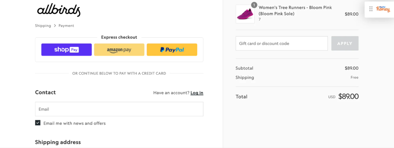
Payment Method Diversity and Conversion
Different customers trust different methods:
- Credit cards
- Digital wallets
- Local payment options
- Buy now, pay later (when appropriate)
The goal isn’t maximum options. It’s relevant options.
Guest Checkout vs. Forced Accounts
Forced registration still kills conversion.
Accounts should be introduced:
- After purchase
- As a benefit, not a requirement
Completion first. Commitment later.
Microcopy at Checkout: Small Words, Big Conversion Impact
Checkout microcopy is where CRO maturity shows.
How Microcopy Reduces Doubt in Real Time
Effective microcopy:
- Explains why information is needed
- Reassures security
- Clarifies what happens next
Examples of High-Impact Checkout Microcopy
- “Why we ask for this”
- “You can change this later”
- “Secure and encrypted”
This isn’t decoration. It’s decision support.
The Most Common Checkout Mistakes We See in Ecommerce
Across ecommerce stores, the same checkout issues appear repeatedly, regardless of industry or traffic size. These mistakes persist not because teams ignore conversion, but because their impact is often underestimated or misunderstood.
Unexpected costs introduced at the final step are one of the most damaging issues. When shipping, taxes, or fees appear late in the process, they trigger loss aversion and erode trust, even if the total price remains reasonable. Shoppers interpret late surprises as a sign of risk, not just expense.
Forced registration creates a different kind of friction. Asking users to create an account before completing a purchase shifts the focus away from buying and toward commitment. At this stage, most shoppers want to finish the transaction, not invest in a long-term relationship.
Silent or confusing error states also disrupt momentum. When a form fails without clear feedback, or when errors are difficult to correct, shoppers are forced into problem-solving mode at the worst possible moment. Frustration replaces confidence, and abandonment becomes more likely.
Inconsistent checkout UX further weakens trust. When the visual style, interaction patterns, or tone change abruptly at checkout, it signals a handoff to a different system, raising doubts about reliability and security.
Finally, overdesigned checkouts often work against conversion. Excessive visuals, animations, or competing elements draw attention away from the primary task. At checkout, clarity and focus outperform creativity.
These issues are not edge cases. They are systemic leaks that quietly reduce conversion across otherwise well-performing stores.
Checkout Optimization as a CRO Growth Lever (Not a One-Time Fix)
Checkout optimization isn’t a one-off cleanup.
It’s an ongoing CRO lever.
The Metrics That Matter at Checkout
- Checkout abandonment rate
- Time to completion
- Error rate
- Final conversion rate
Each tells a different story about friction and confidence.
Why Testing and Iteration Matter More Than Best Practices
“Best practice” checkouts still underperform because:
- Every audience behaves differently
- Every product creates different anxieties
- Every brand carries different trust signals
Effective checkout CRO is about behavior analysis, testing, and iteration, not copying templates.
This is where checkout becomes part of a broader conversion system, not just a UI element.
From Strategy to Execution: How Checkout Optimization Is Implemented in Practice
Checkout optimization rarely fails because teams don’t care.
It fails because strategy isn’t translated into execution.
In practice, the improvements discussed throughout this article are implemented across a few recurring layers.
Checkout UX & Flow
Guest checkout, progress indicators, autofill, and mobile-first field design are usually handled at the platform or theme level. These changes reduce cognitive load and input effort without altering the commercial offer.
Trust & Risk Reassurance
Security signals, return policies, delivery expectations, and payment clarity are implemented through UI components, microcopy, and strategic placement, not through persuasion, but through visibility at moments of hesitation.
Payments & Access
Payment diversity, wallet support, and local methods are typically introduced via payment gateways and checkout extensions, with relevance prioritized over volume.
Behavior Tracking & Diagnosis
Checkout performance is measured through time-to-complete, error rates, step drop-offs, and form interaction data. These signals guide iteration far more effectively than conversion rate alone.
The common thread is not tooling, but intent: every implementation exists to remove uncertainty at the exact moment it appears.
Conclusion
Checkout is the point where purchase intent is highest and tolerance for friction is lowest. When growth stalls despite steady traffic, the issue is often not acquisition but execution at this final step.
Small problems at checkout, unclear costs, unnecessary steps, weak mobile usability, or moments of uncertainty at payment, compound into lost revenue. These issues are rarely obvious, but they consistently affect conversion.
Viewing checkout as a system that can be measured and improved, rather than a static flow, is one of the fastest ways to unlock meaningful conversion gains.
That shift in perspective is where effective ecommerce checkout optimization begins.